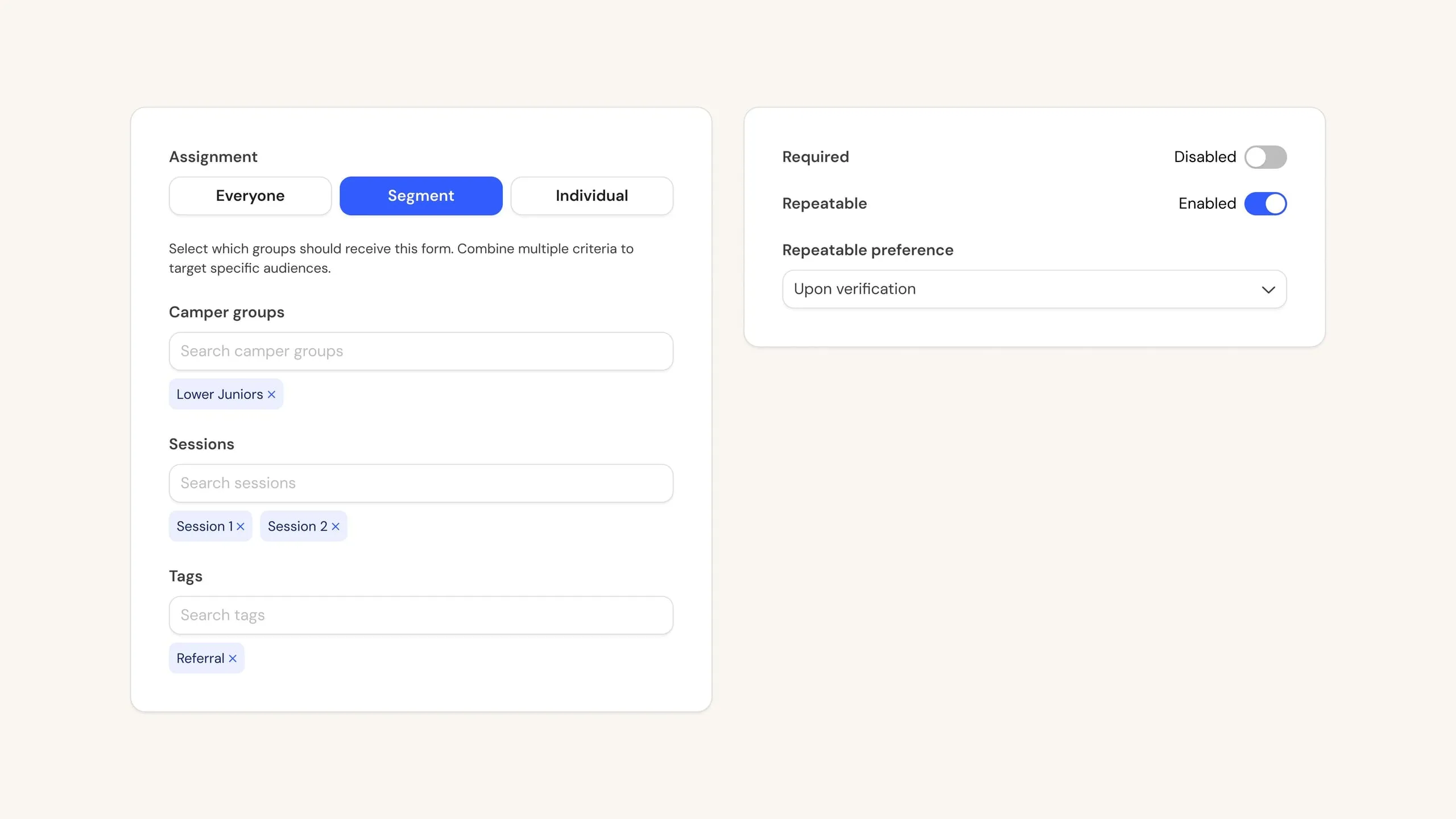
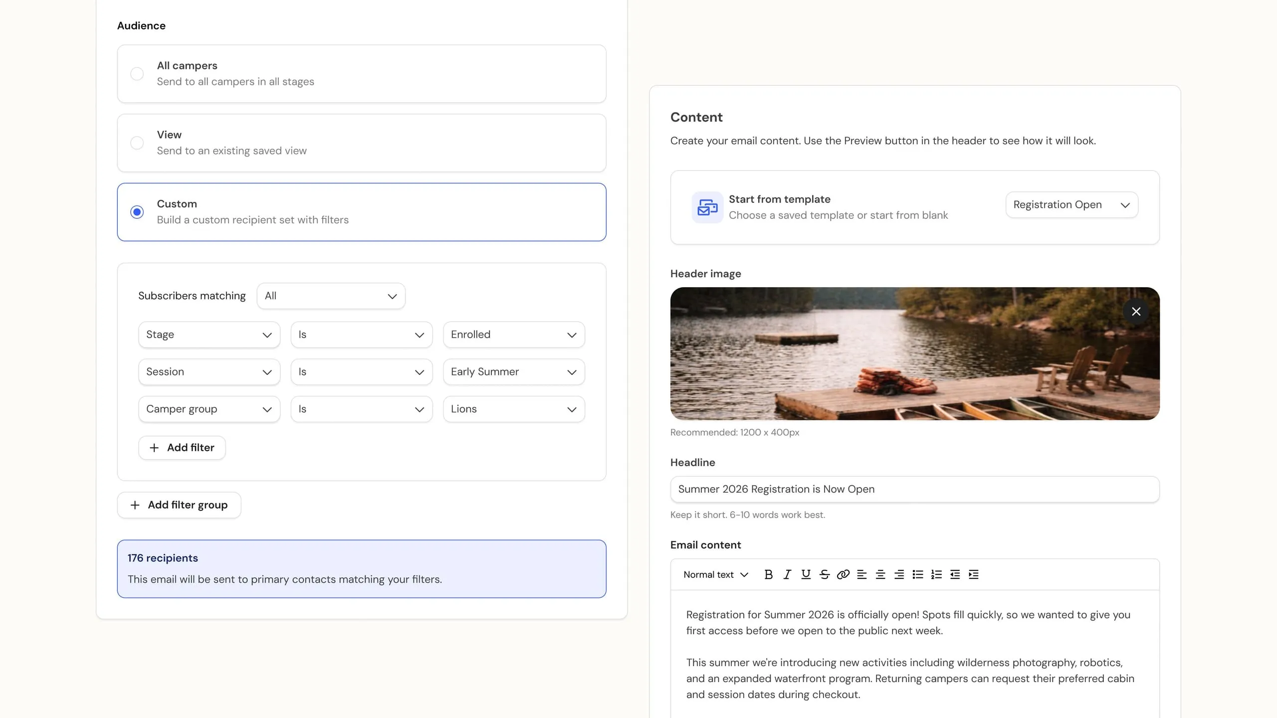
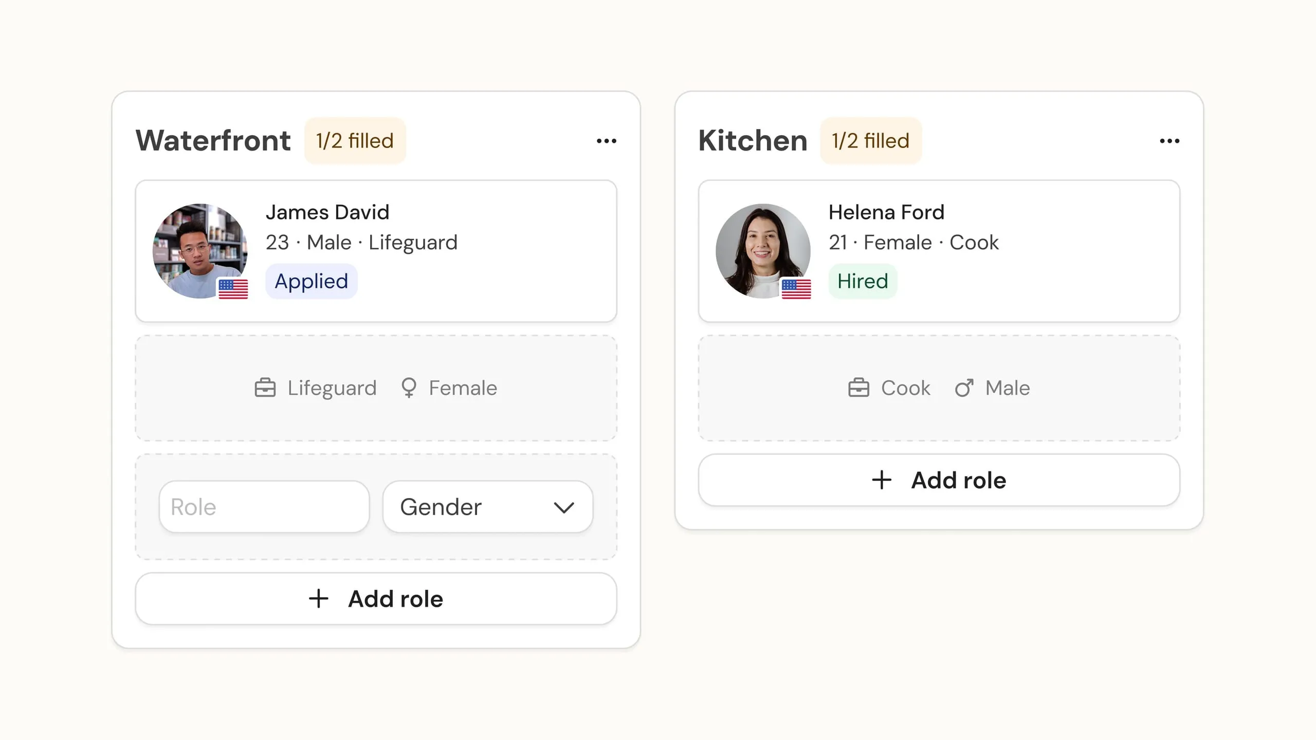
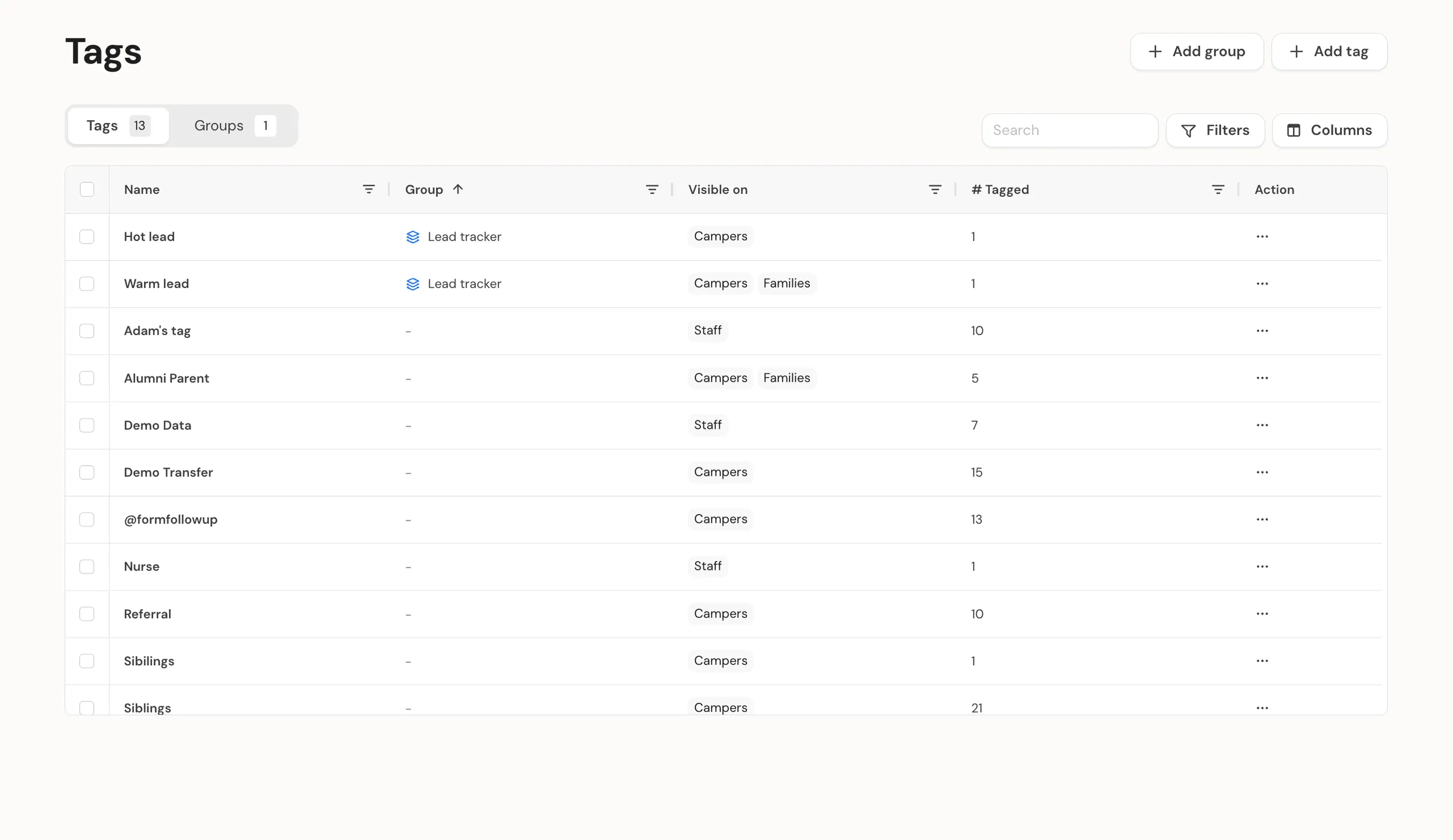
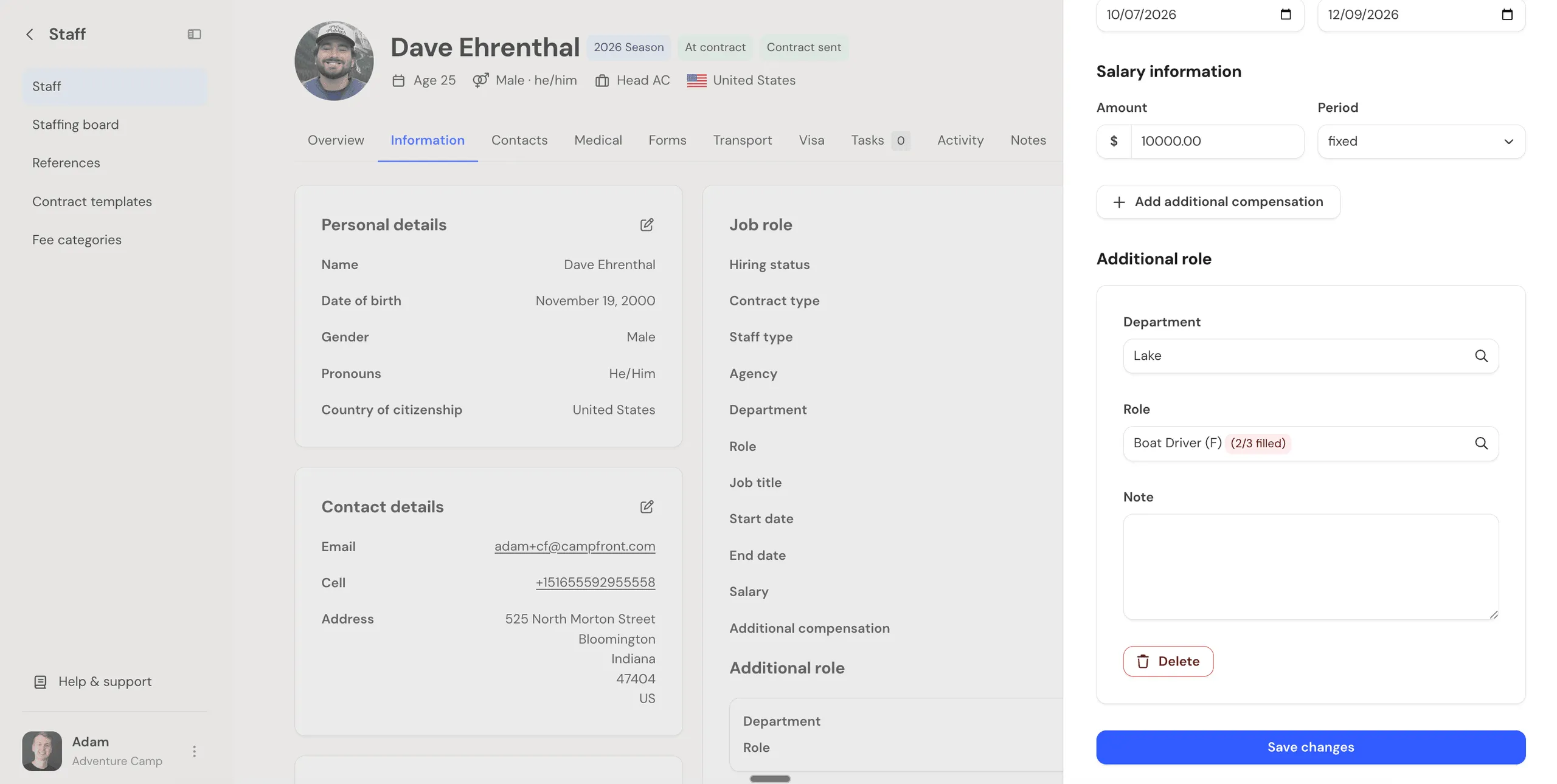
Today we’re shipping the biggest update since our launch: we’ve rebuilt Campfront from the ground up.
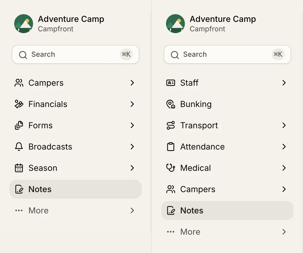
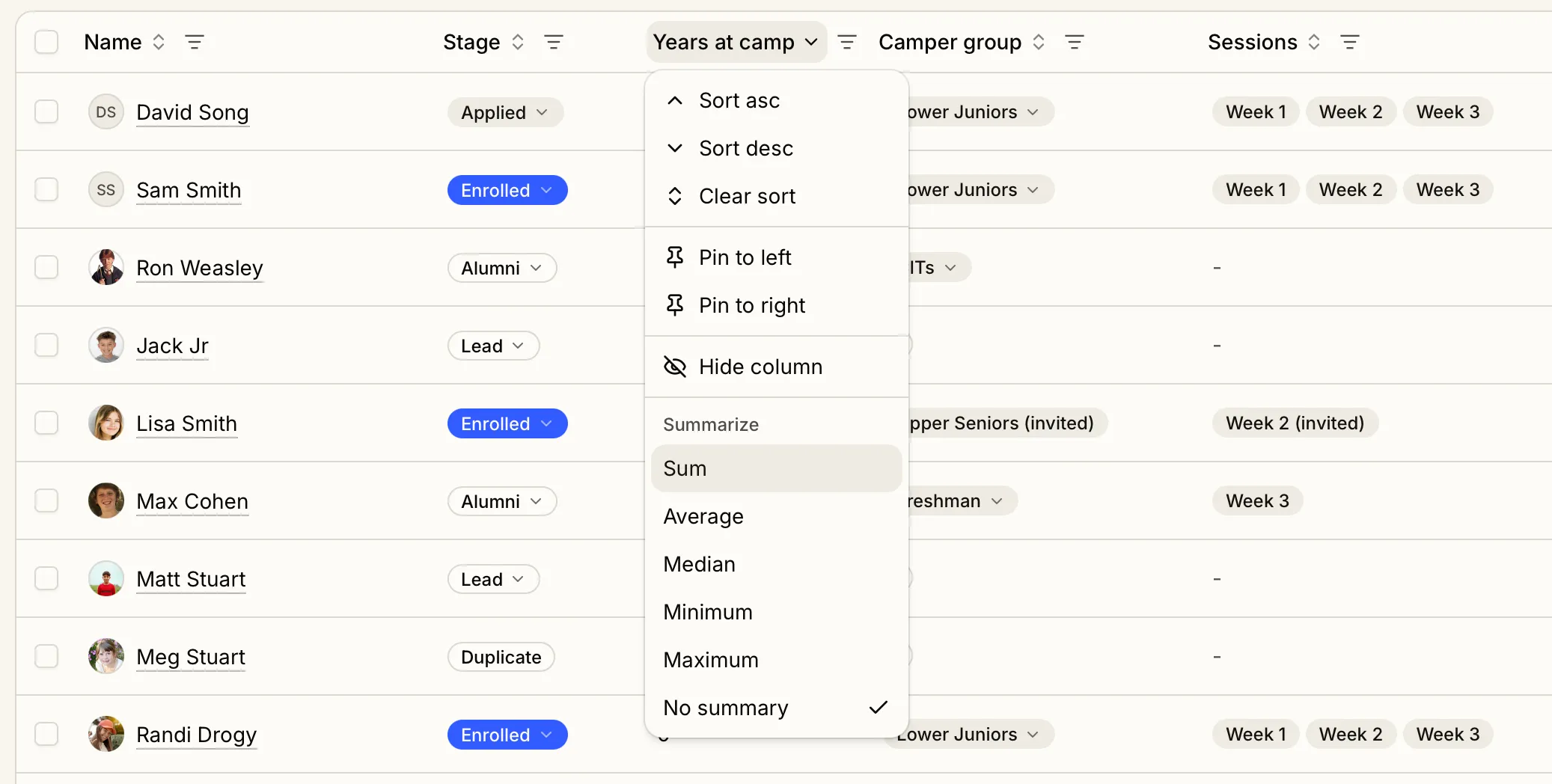
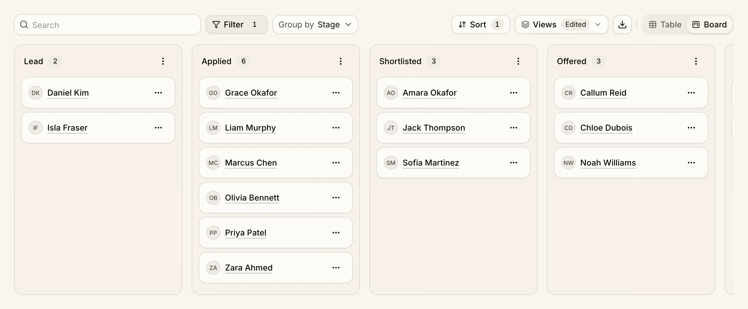
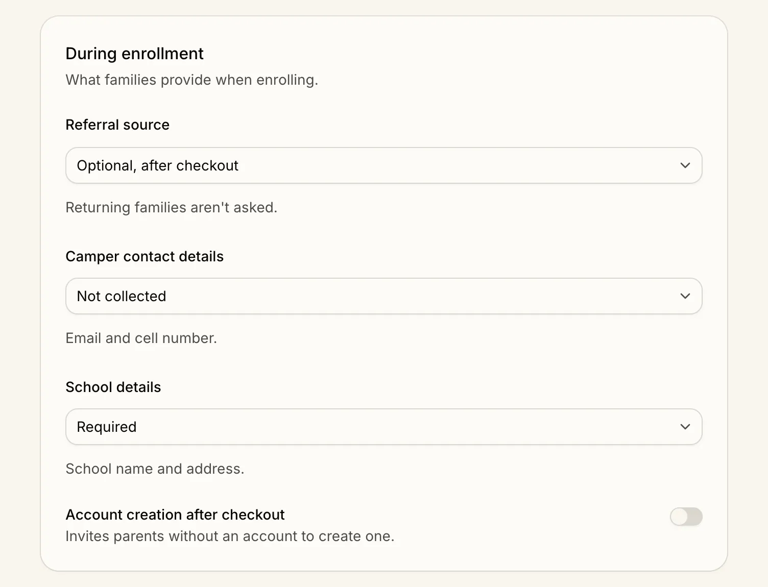
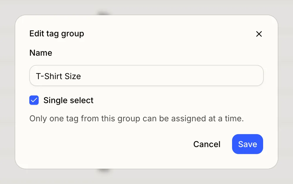
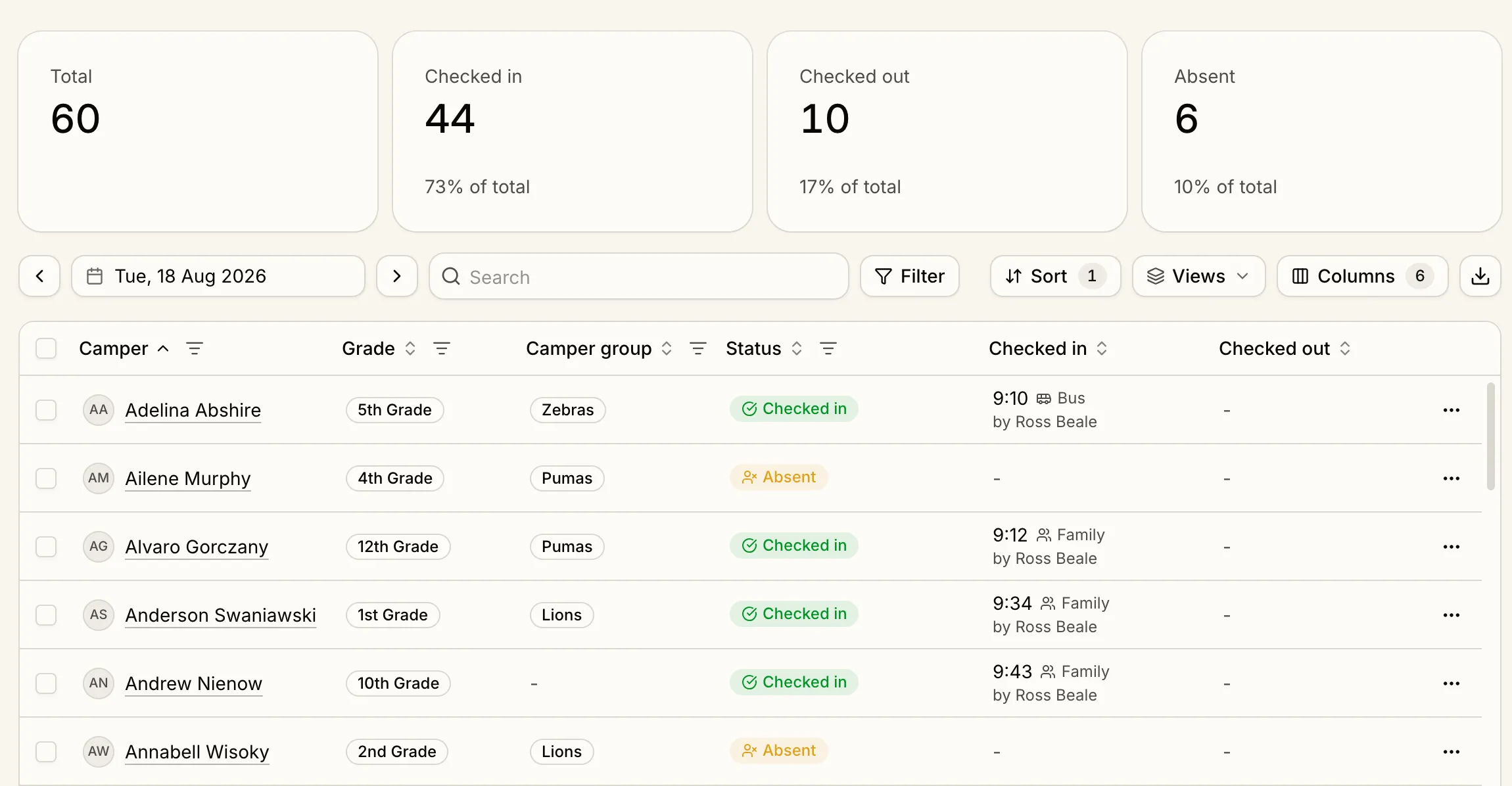
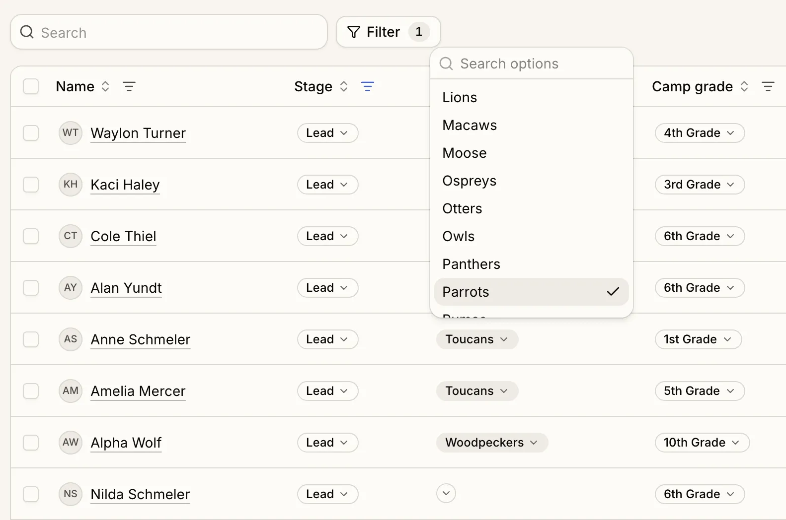
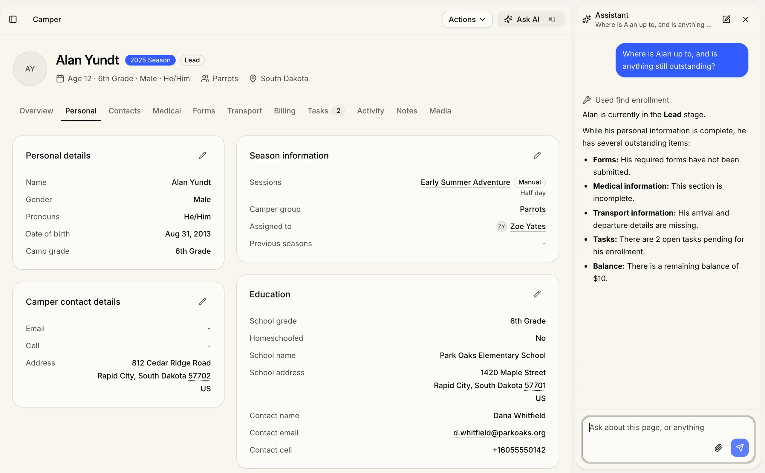
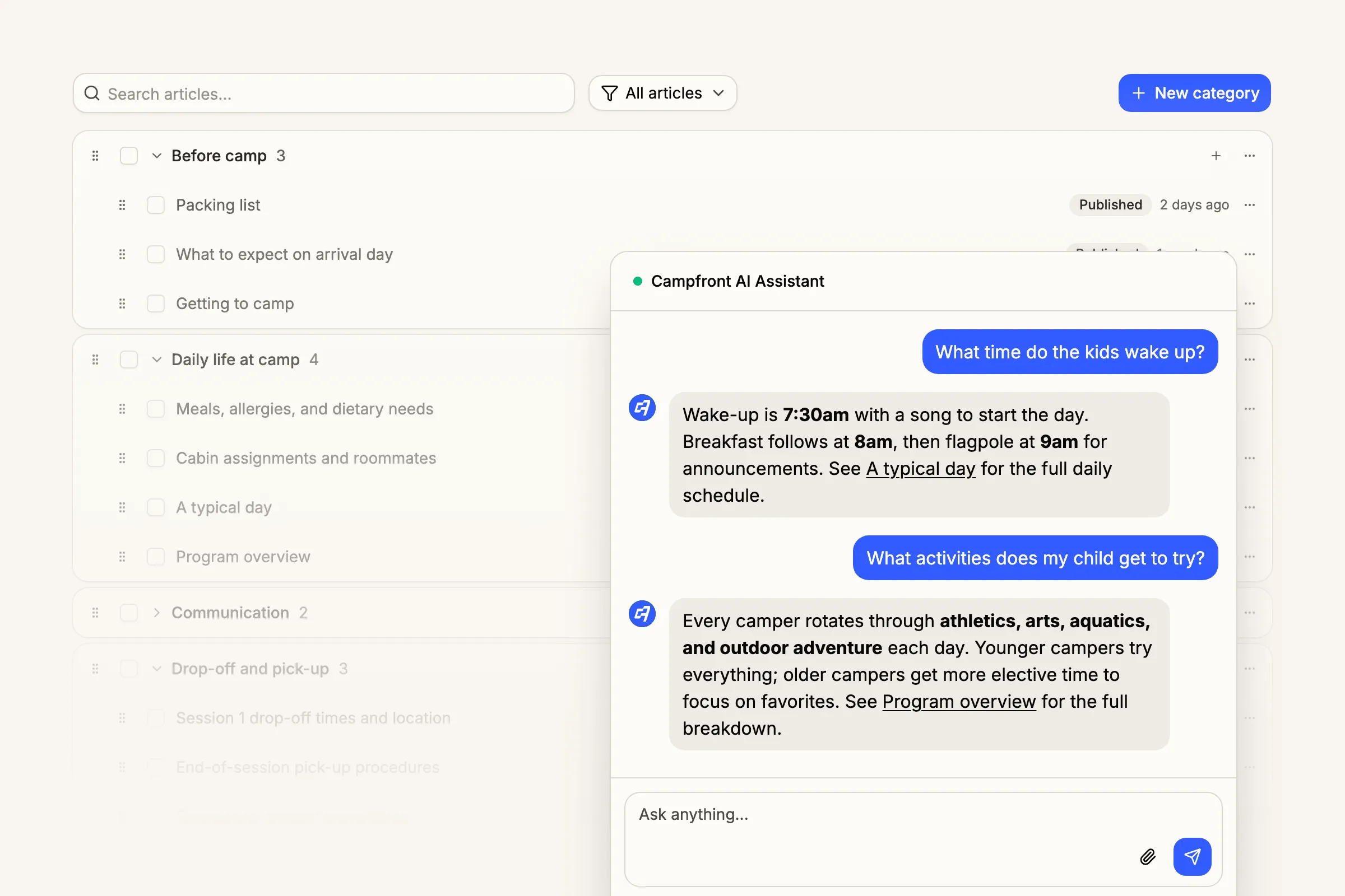
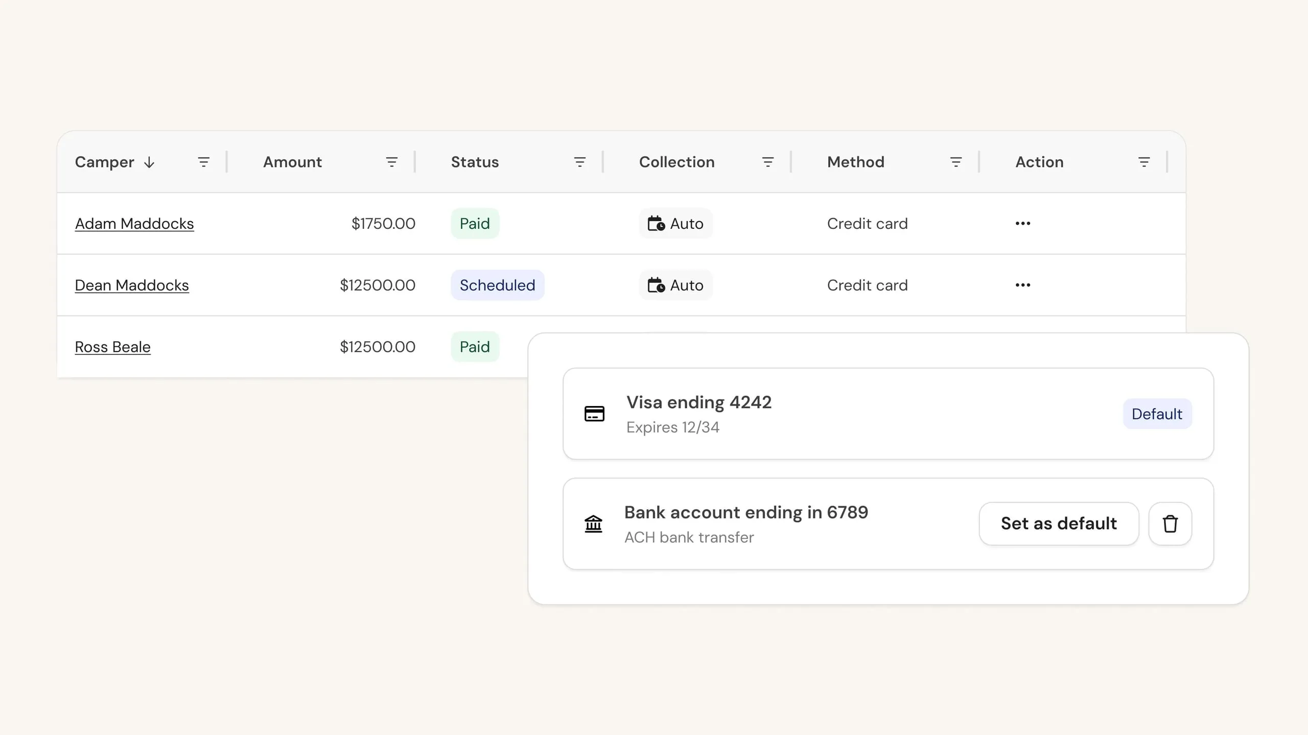
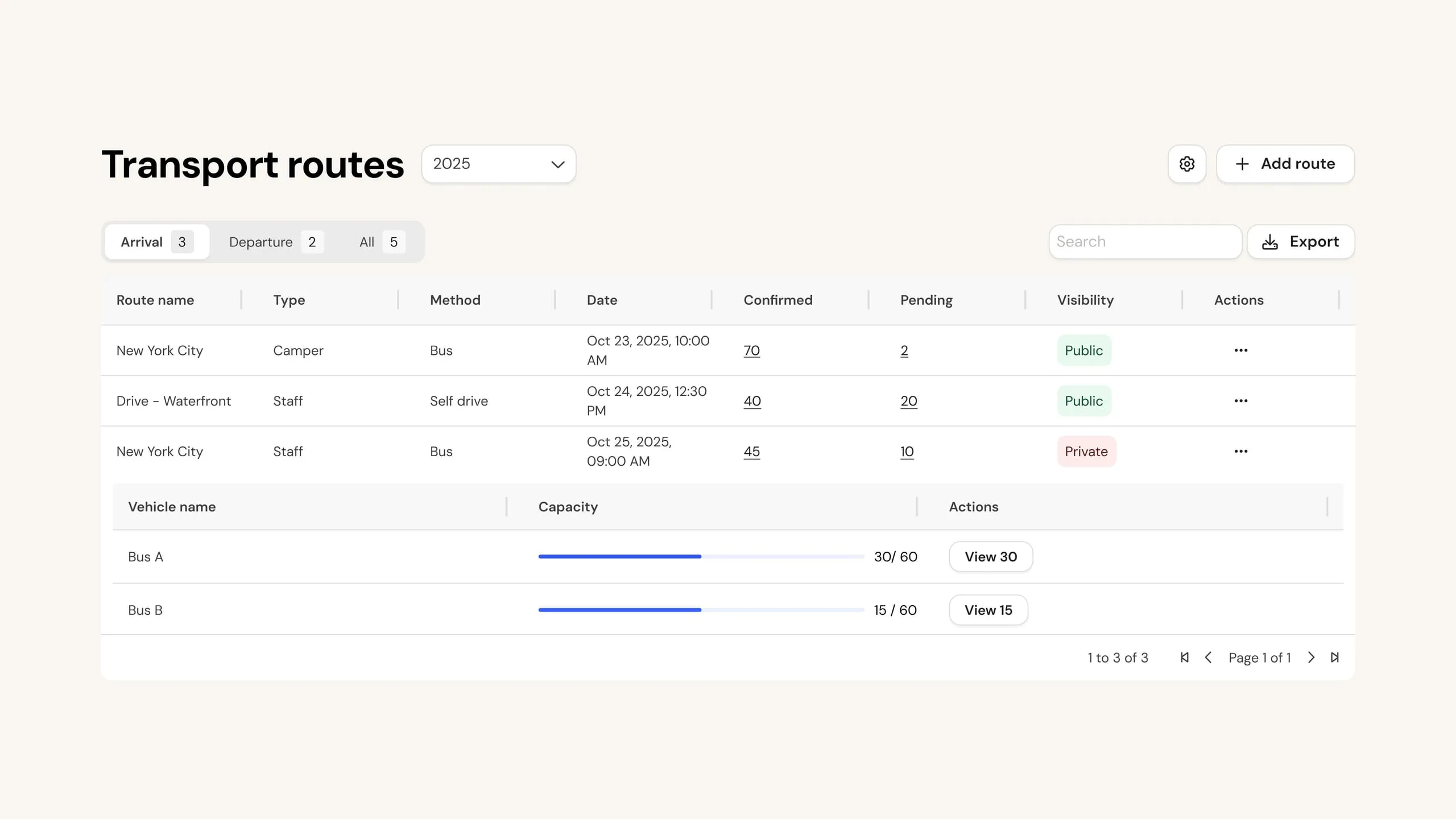
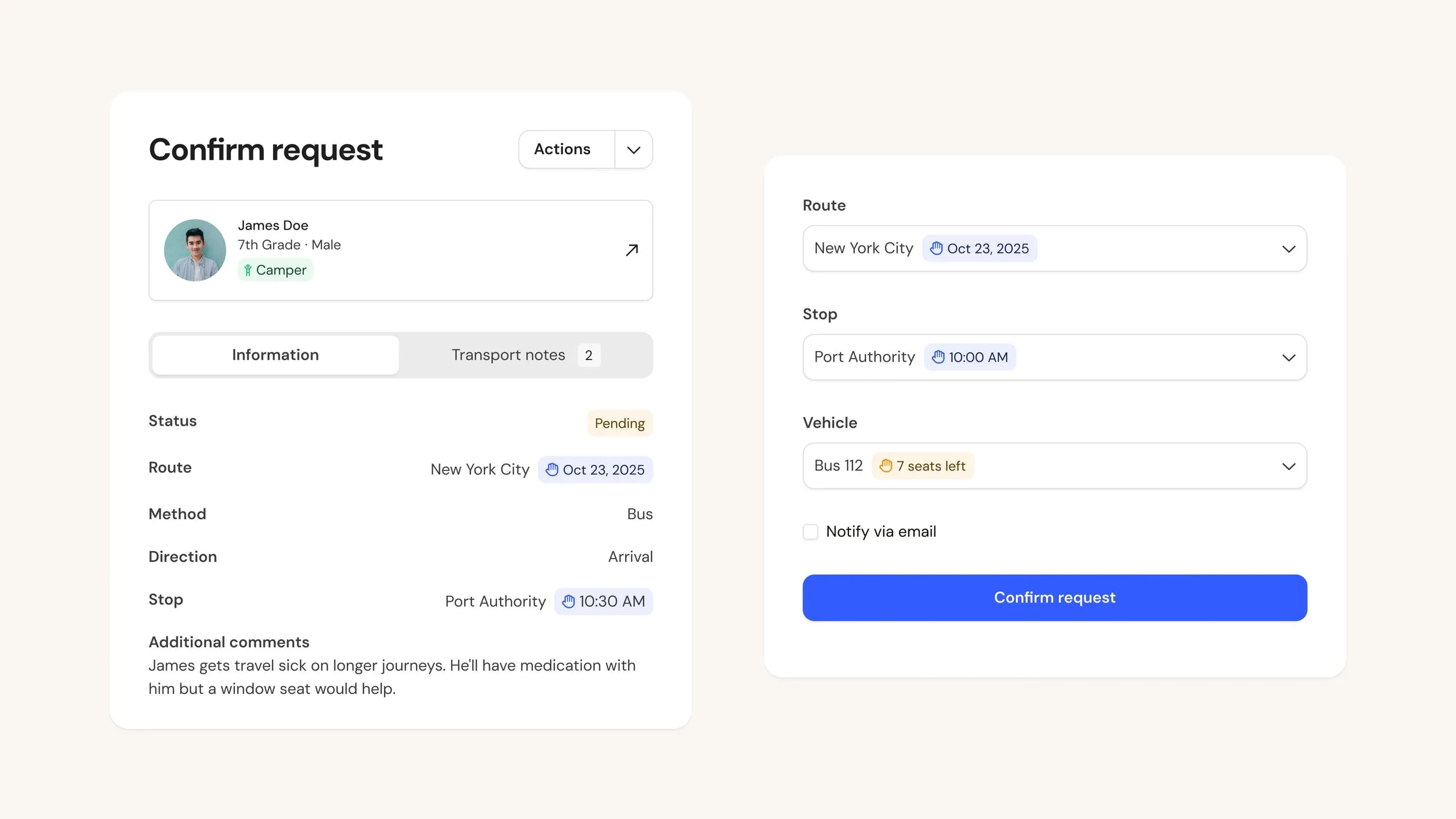
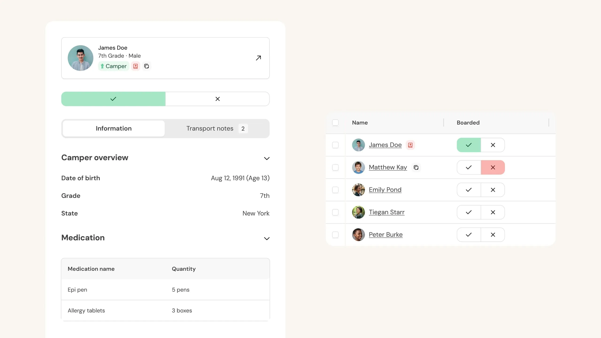
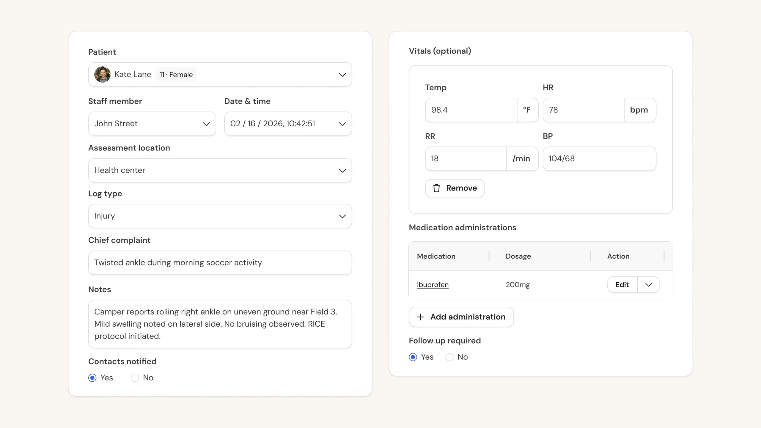
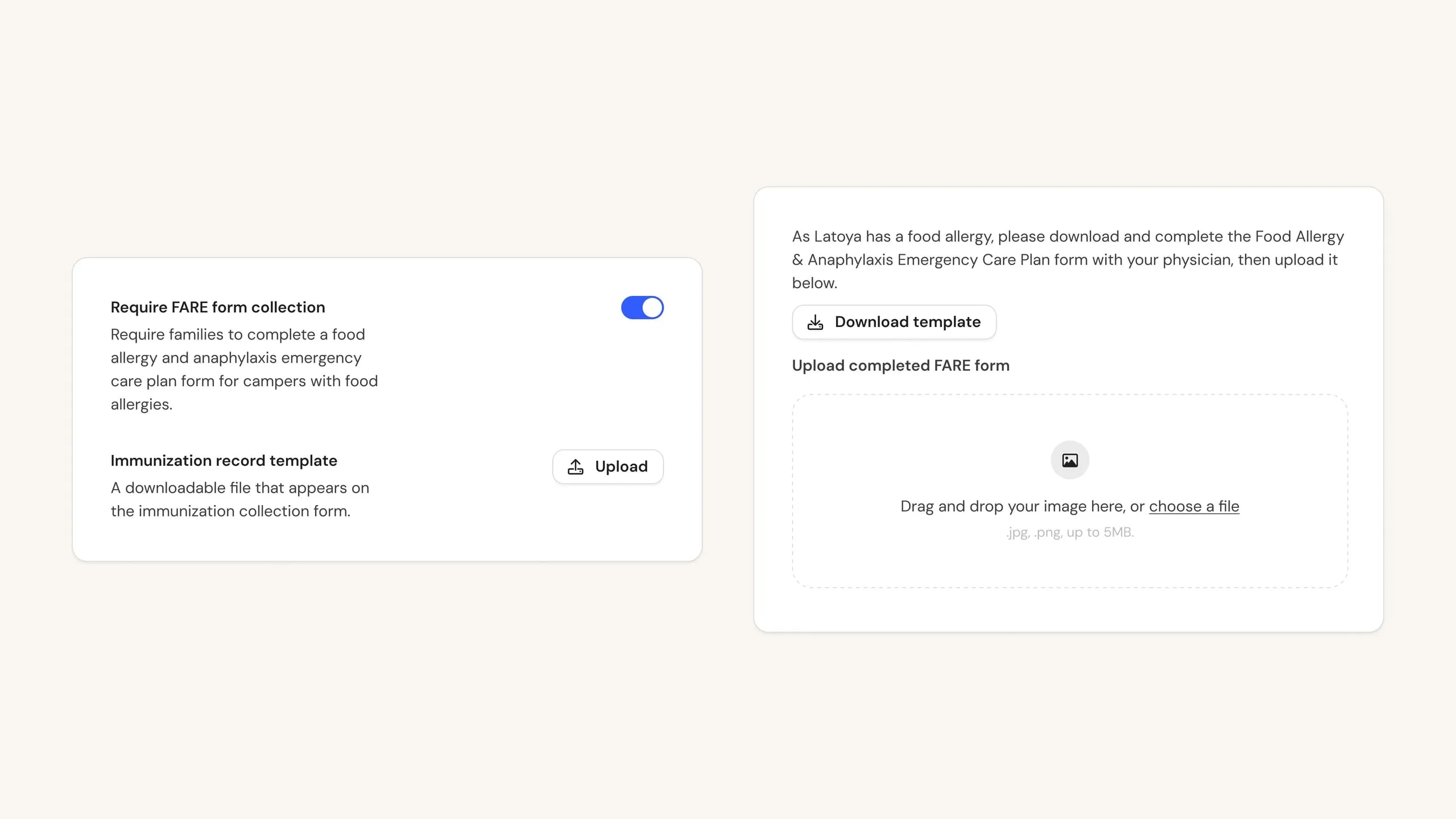
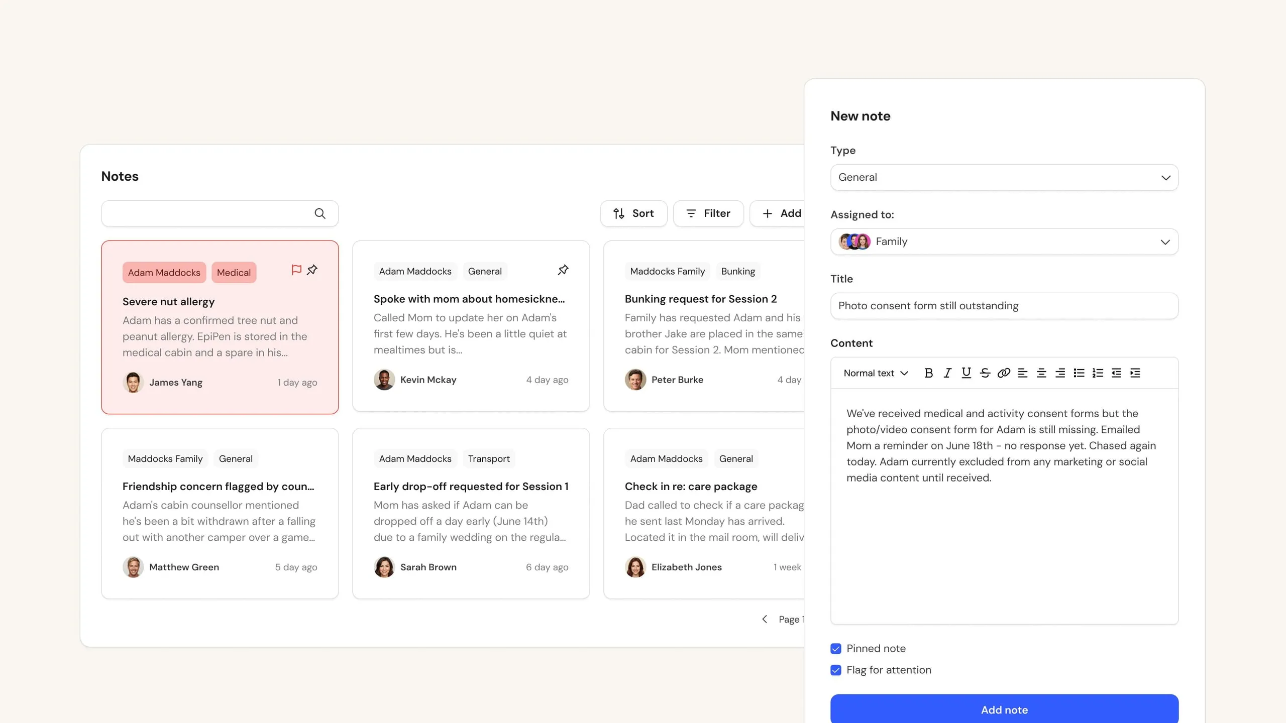
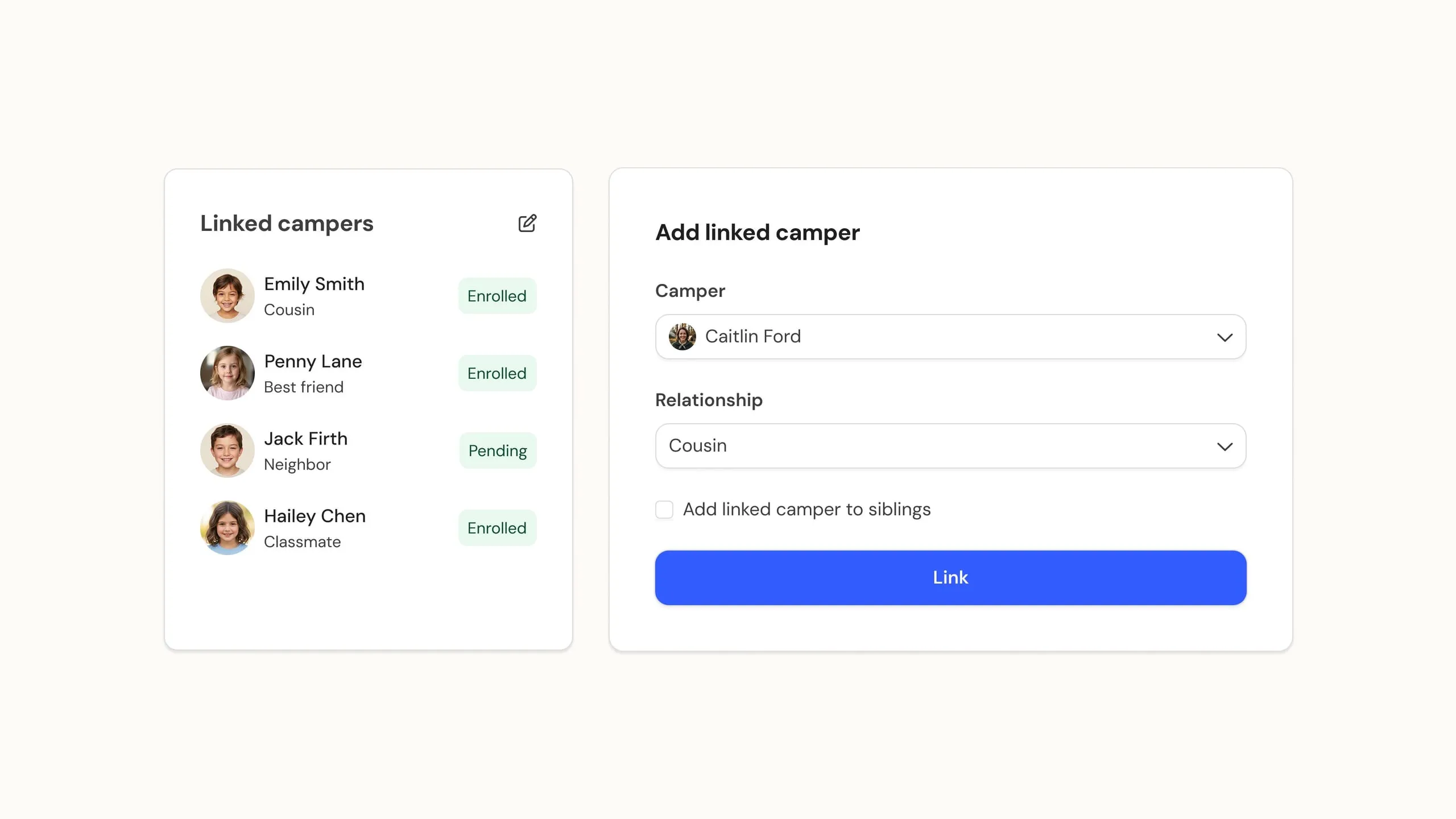
Every screen, every table, every form, rebuilt on a new foundation. It’s not just a fresh coat of paint. The new layout and design system implements your vital feedback, and gives us a platform we can build on and iterate faster than ever, which means the features you ask for get to you sooner.
Here’s what the rebuild means for you:
Accessible. The entire platform meets recognized accessibility standards, from contrast and focus states to keyboard navigation. Everyone at your camp can use Campfront comfortably, whatever their needs.
Mobile friendly. Whether it’s a parent enrolling from their phone, a staff member checking their contract on the bus, or you pulling up a camper profile from the dining hall, Campfront works great on any screen size. No app necessary (but watch this space!).
Faster and more consistent. We are reasonably confident no other camp management software obsesses about large tables scrolling at 60 FPS like we do. Pages load quicker, interactions feel snappier, and everything behaves the same way everywhere. Once you’ve learned one part of Campfront, you’ve learned all of it.
We set out to bring camp tech up to date, and today Campfront is the most modern camp platform on the market for camp admins, camp staff, and camp parents. And this rebuild is just the start. The new foundation is what makes everything we have planned possible.
Your camp, your colors
Alongside the rebuild, we’re rolling out much deeper branding.
Pick a single brand color, and Campfront builds your camp’s entire look from that one choice. Rather than just splashing your color everywhere, we generate a complete, coordinated palette around it: buttons, backgrounds, borders, and both light and dark modes, so everything feels like it belongs together.
Crucially, every color combination is checked for accessibility as we go. If your chosen color would make text or buttons hard to read, we automatically adjust it just enough to stay legible and meet accessibility standards, while keeping your true brand color intact for your logo. You’ll see a live preview and a clear heads-up whenever a color needed a nudge.
The result: a polished, on-brand, accessible experience for your families and staff, without needing a designer, and without anyone having to think about the details.
Dark mode is here
Campfront now has a full dark mode, generated from your brand palette so it looks just as much like your camp as light mode does. Users can switch whenever they like.